
A recent debate on the G31000 forum titled "Test your Risk Matrix" isn't the first time this contentious subject of Risk Matrices has been debated between practitioners and, I doubt it will be the last. The use of a Risk Matrix, which we will explain in this blog article, is broadly popular among enterprise risk managers looking to report aggregated and enterprise-wide view of exposures that threaten their stakeholders. Those that use risk software systems often find that the Risk Matrix comes installed as part of the package and I know some practitioners out there wouldn't procure a risk solution unless this type of report was available from the outset.
The Risk Matrix is a bit of FAIL though and it generally does not yield to the industry of risk management what it promises. Some seasoned risk analysts are so disgruntled with the tool that they choose to drop the whole reporting concept altogether. That is all fine but it doesn't detract from the requirement that stakeholders are going to ask for a summarized view of their risks at some point in time and as it stands, many of them have become accustomed to seeing their world of risks in a matrix.
Disbanding the Risk Matrix to the rubbish bin doesn't seem a viable solution for avoiding its problems, unless something better comes along. So then, let's tackle its flaws and try to resolve them.
For those that aren't familiar with this reporting technique, I better explain it first before we pull the thing apart.
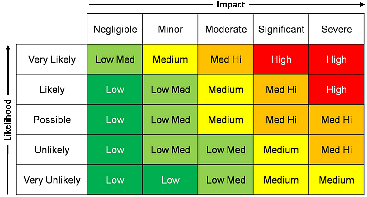
You can think of this space being broadly separated out into three key areas and one fantasy domain with risks will being assigned to just one of these single domains in the matrix.
- Low | Low : Risks can have an improbable likelihood and low impact, there are plenty of these creatures out there.
- Low | Med : Some exposures may also have a low impact but are more commonly occurring.
- Medium : Then there is the symmetrically reverse of position 2, where risks are kind of dangerous (highly impacting) but not so commonly occurring.
- Med Hi & Beyond : Finally, we have the High Impact, commonly occurring fantasy that never really happens but freaks out management all the same when it is reported.
Perhaps the most concerning thing with this type of report is the common misconception that risk falls into some kind of bucket taxonomy of Low, Medium or High and, there can be risks that start out in the low end of the spectrum and mutate across the matrix when left untreated. Risk = Frequency x Magnitude type of risk management ideology is often a tragic side effect from using the Risk Matrix to report risk notwithstanding it is also a tad intellectually lacking.
What's worse is that if risk is thought of as being uncertainty in objectives, as ISO 31000 has defined it so, saying something has high uncertainty is pretty much meaningless in the big picture of it all and definitely needs more attention. You may have risks that have classic epistemic uncertainty; that is you don't really know too much about them, you don't know what causes them or just as bad, what the effects are likely to be. Then there is randomness or aleatory uncertainty, that is you can observe something, you have experienced it, you know it's there and how it works but you aren't fully accustomed to how big this threat could become.
Addressing The Failings
Firstly, it doesn't really matter how big or how many cells we have in our matrix. More the merrier as they say, until it becomes unmanageable in the report of course but anything greater than four cells makes it a grid and then we can say we have some kind of classification going on. The reason for stating this is to press risk managers into measuring risks in a parametric manner, whether that is empirically derived and fitted or through simulation is another story but either way, we are now improving the way in which we represent risk by modelling it as a distribution.
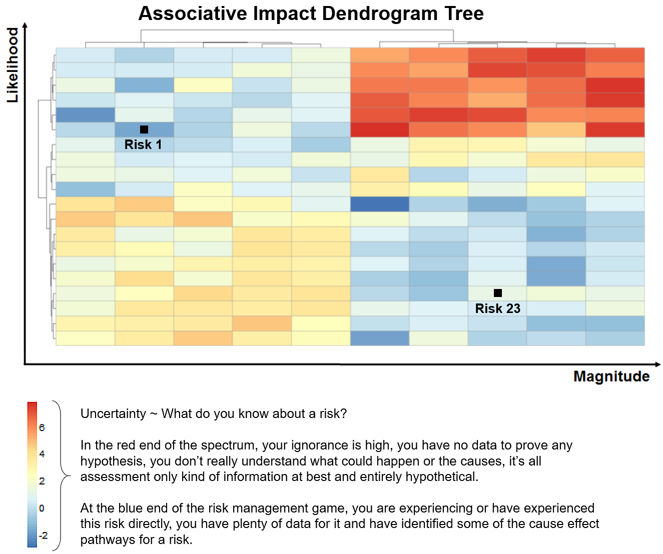
So let's look at this other narrative for a moment; empirically derived (through observed data) or simulation (assessment mixed with Monte Carlo techniques) will give us an outcome either way but we can grade the difference between the two outcomes as some kind of 'Red Uncertainty', ie; we don't know too much about this risk and 'Blue Uncertainty'. In the 'Blue Uncertainty' case we should have captured physical data or evidence to increase our confidence levels around the likelihood and magnitude risk estimates before they are reported in the matrix.
In respect to the distribution(s) estimates (likelihood and magnitude), we probably need to printout two or three Risk Matrix maps side-by-side to represent alternate interquartile ranges; say IRQ 1, IRQ 2 and IRQ 3 and more information on this can be found here [LINK]. Simply displaying the mean position for the likelihood and magnitude of each single risk in our matrix, will drag us back into this ridiculous place of Risk=Frequency x Magnitude.
I have tampered with 3D surface charts to accommodate this additional dimension of risk reporting and there is some merit extending the report in this manner but, many stakeholders also become overwhelmed with what they are perusing when there are too many risk points displayed in a busy 3D surface chart.
Now onto our big problem, which is; how do we make this whole thing stakeholder friendly?
One of the key flaws in any typical Risk Matrix is the lack of 'correlation' or 'association' between elements in the matrix. For example; we could have three risks, say a meteorite strike which is improbable and an earthquake or a tornado that are far higher on the likelihood scale but forget all of this for a moment and just consider the associations more uniquely.
What are the impacts from any of these three alternate risks?
The meteorite strike, earthquake and tornado have a lot in common, don't they! ... All three risks can result in the destruction of an asset, loss of life, disruption to public facilities and much more. If we bunch or interconnect the impacts these three potential risks have, the chance of a power outage from any single risk shoots up in likelihood overall because it now has not just one causal path for existence but three.
The big issue I have with nearly all Risk Matrix reports is that there is no connection between the risks, the 'what' we need to address, the objectives under these risks and their associated controls seem become detached or lost entirely in the report. In our Evolved Risk Matrix example shown above (programmed in R-Project), we have reconnected the risks by adding a dendrogram tree to both of the axis of the Risk Matrix.
To conclude, I believe there is value in a Risk Matrix report but not in the generic way I see it being used. However, with a bit of tinkering, logic extension and modelling, we can make this report relatively useful and quite powerful for stakeholders.
Very good article, thanks for another great contribution.
ReplyDelete